I was running into a problem while trying to get a Bootstrap form to lay out properly. My problem was that the text of labels was getting rendered under textboxes. As I was playing with various Bootstrap styles on my DIVs – for example, ‘col-md-5’, ‘col-sm-5’, ‘col-sm-offset-1’, etc – it quickly became clear that I didn’t know which Bootstrap device environment size I was in.
Bootstrap device environment size? Bootstrap defines styles so that you can easily do grid layouts using a responsive design. In order for it to be “responsive”, it needs to be able to intelligently lay out your content depending on the screen size of the device or browser window. In order to do this, Bootstrap provides you with styles for extra-small (xs), small (sm), medium (md), and large (lg) sizes. When Bootstrap does its grid-based layout, it’s always based on 12 columns per row. What makes life tricky for developers is that the same layout doesn’t necessarily make sense on all devices and you’ll probably want to customize how stuff works. You’ll do this by using some combination of the styles. The styles use a predictable naming convention that is based on screen size. For example, setting the style on a DIV to ‘col-sm-2 col-md-5’ would cause that DIV element to take up 2 columns on a small device and 5 columns on a medium device.
As you can imagine, when you’re applying styles to your application, it’s important to know what it looks like at the various sizes and what size you’re currently looking at. I wanted a way 1) to see the Bootstrap grid columns, 2) to quickly see what environment I’m in as I resize the window through the various environment sizes, and 3) to be able to toggle some kind of grid border around certain controls so that I could see how Bootstrap was actually laying them out.
Download the complete ASP.NET MVC code sample View an HTML-only sample
Display the Bootstrap Columns
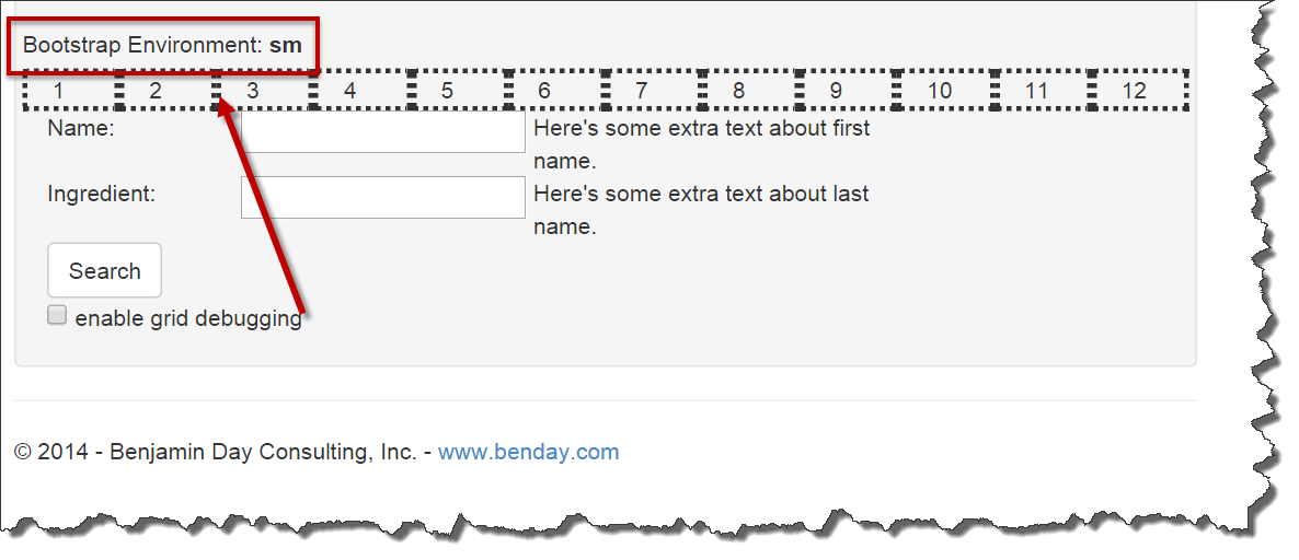
The first one – being able to see the grid columns – was easy. I wanted to see a 12 numbered grid cells in a row like the image below.

In order to do this, I simply needed to add the following DIVs to my HTML:
The class attribute value of ‘col-sm-1 col-md-1 col-lg-1’ ensures that it does the same layout on all the screen sizes. The style attribute with the value of ‘border-style: dotted’ means that the border of each DIV will be dotted.
In order to save me some tedious and repetitive typing in my ASP.NET MVC applications, I created an extension method for HtmlHelper (aka. “@Html”) that lets me quickly drop this into my views.
public static MvcHtmlString DisplayBootstrapColumnDebugRow
this HtmlHelper
{
var divTemplate =
"
var builder = new StringBuilder();
builder.AppendLine("
for (var i = 1; i <= 12; i++)
{
builder.AppendFormat(divTemplate, i);
builder.AppendLine();
}
builder.AppendLine("
return new MvcHtmlString(builder.ToString());
}
I can call it from my view simply by calling @Html.DisplayBootstrapColumnDebugRow().

Display the Current Bootstrap Device Screen Environment Size
Next up, I wanted to be able to see which screen size I was in as I resized my browser window. In the image below, my browser was sized so that Bootstrap thought I was working on a small device.

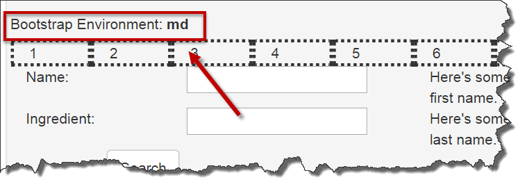
If I resized the window to make it bigger, this value would automatically change to say ‘md’ or ‘lg’. In the image below, I’ve resized my browser to be of medium size and Bootstrap thinks the window is ‘md’.

In order to implement this, I tweeked some javascript code from this post on stackoverflow.
function displayBootstrapEnvironment() { // add the following control to your html body
//
var element = $('#bootstrapEnvironmentName');
if (element.length > 0) {
var environmentName = '(element is not in a bootstrap environment or not found)';
var possibleEnvironmentNames = ['xs', 'sm', 'md', 'lg'];
$tempElement = $('
$tempElement.appendTo($('body'));
for (var i = possibleEnvironmentNames.length - 1; i >= 0; i--) {
var currentEnvironmentToTest = possibleEnvironmentNames[i];
$tempElement.addClass('hidden-' + currentEnvironmentToTest);
if ($tempElement.is(':hidden')) {
$tempElement.remove();
environmentName = currentEnvironmentToTest;
break;
}
};
element.text(environmentName);
}
}
$(function () {
// when the window is resized, the bootstrap environment info is refreshed
$(window).resize(displayBootstrapEnvironment);
// when the page loads, the bootstrap environment info is refreshed
$(document).ready(displayBootstrapEnvironment);
});
In the HTML, I added the following named control that would be populated by the javascript/jquery code.
As the window is resized, the javascript code executes and the environment size value gets populated.
View the Bootstrap Grid for Specific Sections of the UI or Controls
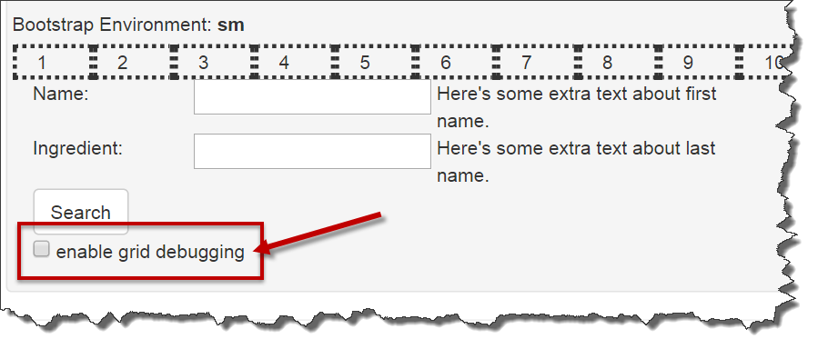
Even after I could see both the environment and the grid columns, I sometimes still couldn’t tell exactly where Bootstrap was putting the controls in relation to the grid. For this, I wanted to be able to toggle the grid lines around just a handful of controls. I did this by adding a checkbox to enable and disable bootstrap grid debugging and then adding a CSS style and some javascript.

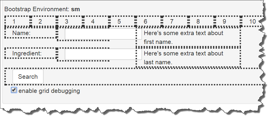
If enable grid debugging was turned on, I wanted something like the following image:

Here’s the code for the checkbox and the CSS style. The magic on the checkbox happens via the onclick handler which calls the toggleGridDebugging() method.
Here’s the javascript method for toggling the debugging. It works by modifying the ‘debuggableGridDiv’ CSS style and changing the border-style from ‘none’ to ‘dotted’ and vice versa.
function toggleGridDebugging() {
var element = $('#enableGridDebug');
if (element.is(':checked')) {
$(".debuggableGridDiv").css("border-style", "dotted");
}
else {
$(".debuggableGridDiv").css("border-style", "none");
}
}
Once you have this code in your HTML page or ASP.NET MVC View, you simply have to add the ‘debuggableGridDiv’ to any DIV that you’d like to enable/disable grid lines for as shown below.
Summary
I hope that these things help you to debug your Bootstrap responsive grid layouts. Click here to download the complete ASP.NET MVC code sample. Click here to view an HTML-only sample.
-Ben


