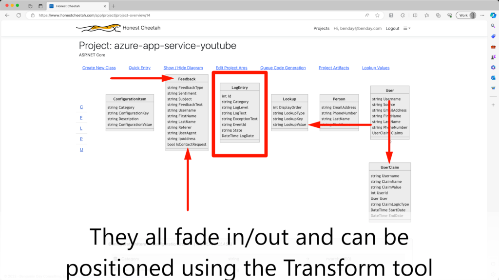
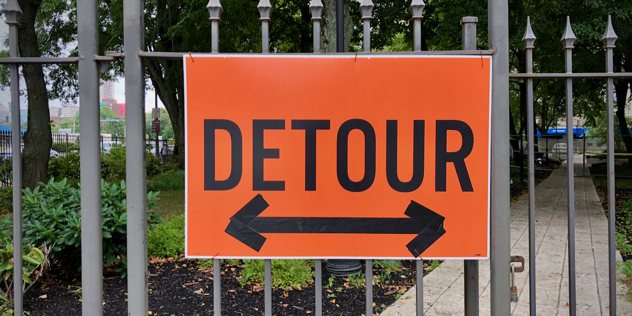
This is a little outside of what I usually post but I figured I'd share. I've been using Final Cut Pro to edit my training videos. Since my videos are all about tech, I frequently need to point to buttons or controls on a screen or highlight a region on a screen.
I had an oddly difficult time finding simple arrows and rectangles -- everything was too complex or too visually loud. All I needed was some simple stuff that would fade in and fade out.
So I created what I needed in Motion as custom titles.
Arrow & Rectangle callouts for Final Cut Pro
I will freely admit that I am not anything close to being an expert at creating things in Motion. TBH, I'm probably not that great at Final Cut Pro either. Creating the arrows was reasonably straight-forward.
The rectangle was a HUGE PAIN to create because I needed to figure out how to resize the rectangles without also scaling the width of the rectangle border. Plus making a shape that was size-adjustable was borderline impossible. I managed to get something working that would allow me to adjust the size using the Hand tool but it's a little janky. (If anyone has suggestions on how to make it better, I'd love to hear it.)
Here's a demo video of the title callouts.
Demo of Arrow & Rectangle Callouts in Final Cut Pro / Motion
If you'd like to use these in your own Final Cut Pro projects, here's a link to download these custom arrow & rectangle callouts.
I hope these help.
-Ben


